As a Graphic Designer I get to work on a whole load of different projects, some big, some small and some super interesting. Every now and then you get something that lands on your desk that's the great white buffalo, ( 10 points for the Hot Tub Time Machine reference. )
Whenever I'm not staring lovingly into an Apple product or finessing Typography Ligature, I'm probably on my bike. I'm an avid Mountain Biker and it's always been a strong passion of mine. This is why when the Head of Marketing at Specialized got in touch asking if we'd be interested in taking on a Design project for them, I had kittens. I quickly remembered that due to quite serious cat allergies kittens were an ineffective form of affection for me, so I hastily re-homed them to a small collection of lonely elderly women, and then got straight back to being stoked about this new project.

Every year Specialized holds an event; Trail Days, which is the biggest Mountain Bike party of the year. It's three days of proper festival goodness in the Lakes. You get to check out and ride ( for free! ) new demo bikes, throw yourself down some epic trails, ride with pro athletes, listen to live bands and drink beer before napping it up in a tent on an evening. It doesn't really need a sales pitch, it's properly awesome. So the annual event was in it's planning stage, and we got the opportunity to make all the pretty stuff for it. Sweeeet!
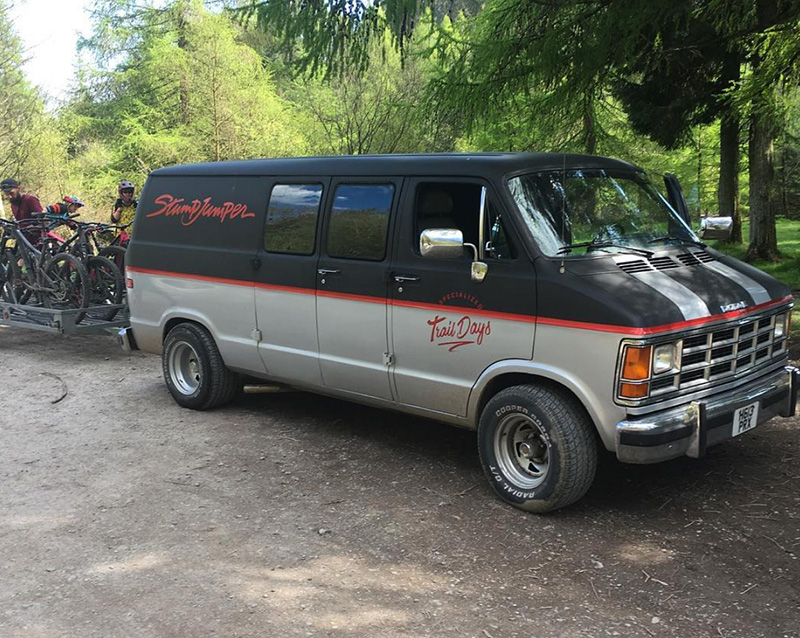
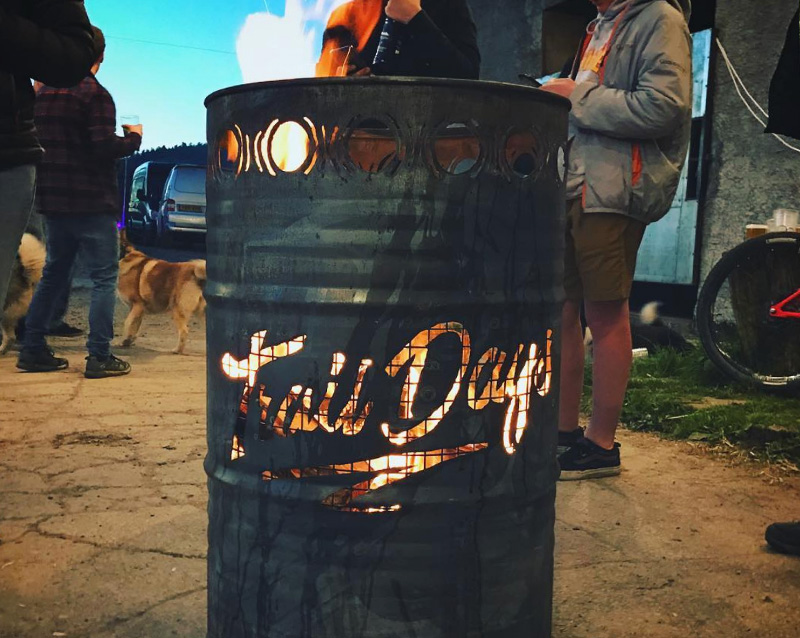
First up we started with Branding. This was a tricky one as we were given a design brief, explaining that it needs to be suitable for more or less every application and situation. Looking at versatile designs and the best way to get across a marketing message, I settled on a circle shape as the starting point. It has it's own bounding area, is renowned for being a memorable shape for logo designs, and generally stands the test of time. Bikes are obviously composed of a lot of circles too, with a lot of their hardware being, well, circle. So we'll call that a win too. I ended up creating a variety of logos, some full circle, some purely wordmark, but always including the central 'Trail Days' typography for solid consistency. As it turned out in the end, if it could be branded, it got branded. Trail Days logos were everywhere throughout the event. My favourite by far being a barrel... On fire! A novel way to stay toasty.

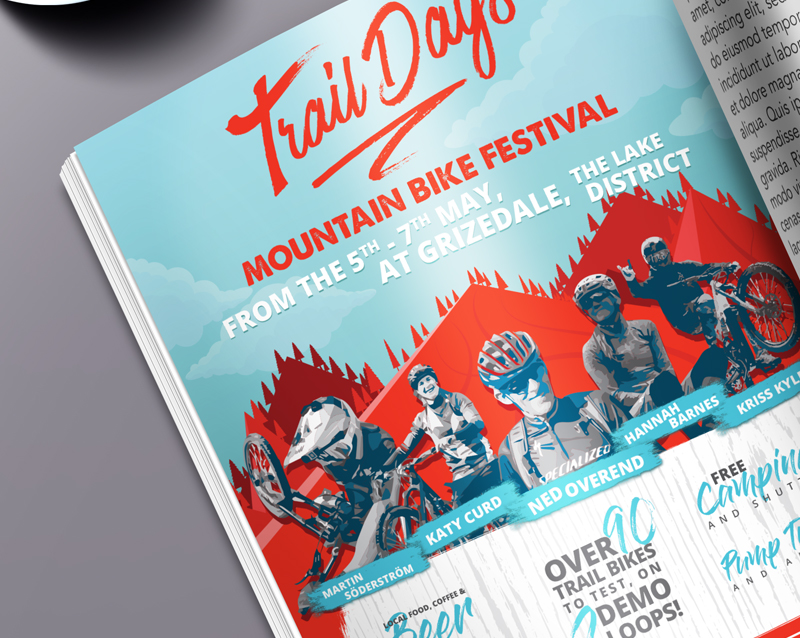
Next up we started on the Posters. These were to advertise the event of course, but were then to form the basis of a mini site, a social media plastering, and an ad campaign. I put a lot of love and attention into the little details on here and really tried to build up a library of vector assets to help me in creating a cohesive set of design materials. I especially enjoyed vectoring the pro athletes, something I've never actually done before. That in itself was a learning curve, but they were super happy with the end result and so were we! After the poster design was down we moved onto a full page advert in Britain's best selling bike magazine, MBUK, and then made a start on handout materials.

These ranged from tickets, to maps for the weekend, wristbands, and registration forms. The clear standout to me though was the beer. Specialized and Ulverston Brewery teamed up to create a specific beer for their weekend, called... Wait for it... Trail Ale. What a name. We went nice and simple on the beer labels and I'm really glad we did. Ornate beer bottles are beautiful, but I really wanted the beer to replicate the lifestyle of being outdoors and riding. Just nice, simple and functional.
All in all the Trail Days project was arguably one of the best projects I've ever worked on. The list of deliverables was vast and ever-changing, the time crunch was always on and I was the only designer working on the entire project, but I properly loved it. My design work saw a massive audience, and I got that tickly feeling in your stomach when I went to pick up a copy of MBUK - Knowing I had a full page ad in there. We continue to do design work for Specialized to this day, and you'll no doubt see a lot more from us about that, but I think this will always be a project that really stands out to me.
