Within one of our recent projects we really had to take this on board and change our design process to suit. RPS Assist came to us in need of a fresh branding experience and website. They specialise in taking care of people that have just been made redundant, and look to be an online portal in which people can get information on where they stand, what they can do, and how much they could be entitled to from the Government. Whenever the word redundancy is used it's always going to be with negative connotations, and so the start of our design process in which we look at the personality and tone of the visuals was one that we appropriately elongated.
Colour & Logo
The average user that comes to the RPS website is going to be in a less than desirable state of mind. That's a given. So after researching advanced colour theory, typography styles and specific layouts with an enlightening purpose in mind, I settled on a light blue colour palette, and made sure to include a lot of soft rounded corners within the typography and logo. The speech bubble element around the text was an element that I thought really rang true through the service they provide, and finished off the branding perfectly.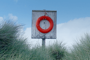
The life-ring
Associated imagery was the next port of call. I had a good idea on colours and themes that would run throughout, but I often like to include a mark or image that links to the company. After quite a few different ideas we all settled on a life-ring. As a symbol it represents what we were trying to get across to the user without brashly forcing the point, and the rounded edges suited the environment brilliantly. Placed within a care-free scene, the banner for the home-page was born. A welcoming addition to any stressful environment as I'm sure you'll agree.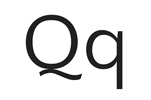
Font choice
The fonts used in this website were quite a tricky one to conquer from my perspective. I wanted something that would compliment the logo typography, but read well and be easy to scan in a hurry. I'm a massive fan of Google's font repository, and when designing for Web use those over any other, unless directed otherwise by the client. I settled on Quattrocento Sans, a self confessed classic, elegant typeface that's both readable and non-intrusive. Just what the doctor ordered!With the website design itself I wanted everything to be easy to take in, available to navigate to straight from the first load, and look both attractive and informative. I think full width slideshows with key messages are a great way to educate the customer without being too over-bearing. Large call to action buttons were also used throughout to give clear, obvious direction to the user. Everything was then lavished in a great deal of padding to give space and draw the attention to the necessary components of the web-page.
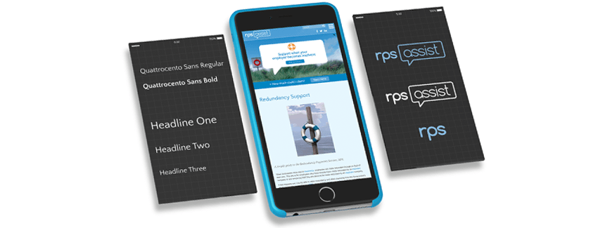
The overall design of the RPS website and branding is something I'm personally really happy with. The client really likes the different elements and loves the fact that we've gone through the various stages to think every design choice through. It's nice to know a client is safe in the knowledge that everything has been done for a reason and very much suits it's purpose. The website has been fully optimised for both phone and tablet use, and will hopefully be an ever-growing source of valuable information for the unfortunate folk that have to fend through the redundancy process. Job well done.