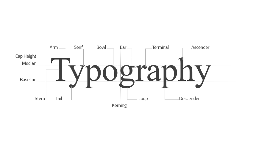
Fonts come in all shapes and sizes, and each typeface brings its own unique features that subconsciously affect the customer whilst they take it in through a design. The main classes of type are Serif, Sans-Serif and Script. There are of course many, many sub-categories within each class, but we’re going for more a crash course in this article, as opposed to a car crash of information.


Serif
Serif fonts are more traditional in their appearance. To put it simply if a font has small lines attached to the main strokes of the letters, it’s a Serif font. They’re great for print documents and title fonts, although in recent years there’s been a shift in opinion as to whether Serif fonts in long passages of text are as legible as they could be.
Sans-Serif
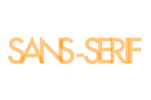
Sans-Serif fonts don’t have the same protruding details that Serif fonts do. Because of this they look a lot more modern in their appearance. I personally really enjoy using Geometric Sans-Serif fonts as they’re as modern as they are legible. Futura for instance is easily one of my most favoured ‘go-to’ fonts.
Script
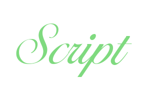
We’ve all seen Script fonts. Whether it’s in the form of a questionable tattoo, restaurant menu signage, or on your favourite brand of soft drink packaging. Script fonts tend to be split into two sub-categories; Formal, and casual. Formal Script fonts showing more of a 17th century handwritten letterform style, very precise and pretty. Casual Script fonts more often than not depicting hand-writing or brush strokes.
They All Have A Place
Apart from Comic Sans, which doesn’t. Ever. But how do you know when it’s best to use a certain font? Simply seeing your wording in your chosen font and taking your initial reaction at face value will give you an immediate indication of whether you’re using a suitable font family. There’s definitely an art to knowing which font works for certain settings, and it’s a skill in which I’m constantly looking to develop. The simplest explanation is that if you had a law firm, you wouldn’t use a hand-written script font for your logo would you? It just wouldn’t ‘fit’ the scene.The next time you’re struggling to figure out whether it’s a Serif, a Sans-Serif or a Script font that you’re looking to use, just break it down and remember what each font signifies. There’s certainly not a ‘one size fits all’ approach to type, and as with almost everything in design – there will be an exception to the rule. But by giving each type face a personality and remembering the feelings that each font conveys you’ll soon be on the road to knowing almost instinctively which fonts suit each situation. Referring back to the paragraphs describing each style of font will definitely aid the process, and as with everything creative; if it doesn’t look right, it probably isn’t! Don’t be scared to experiment with type. If the piece you’re working with doesn’t look right, ask yourself why, and use your own feelings and thought processes to further your design and your knowledge in one swift action.
Typography is an art form in itself, and as we move towards an era of open source font directories there’s never been a better time to have a healthy interest in seeing what’s out there. The right font can really make all the difference to your design, and take your business image to the next level. Or alternatively, get in touch with us, and I’ll take care of it all for you!