One of the most interesting features was their new visitor register system, which they use to sign-in their visitors during their events at the Observatory. With us living in the digital age, we thought it was only natural to create a specific iPad app to do just that, replacing their paper system. But with the Observatory being such a specialist environment there was an awful lot of back-end thought that went into the design of the look and feel of the system, particularly around the amount of available light...
It's pretty dark at night...
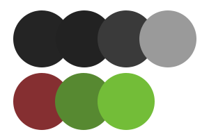
As we all know when we've woken up in the middle of the night to check the time on our phones, being overwhelmed by a sea of white light isn't the most appropriate thing in a dark room. Black spots in your eyes anyone? You know what I'm talking about. With the Observatory naturally hosting the vast majority of the events at night, we first had to overcome the light issue. A dark colour palette was of course going to be the most appropriate choice for the setting.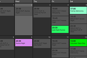
Integration with the calendar
With the website having such a strong Calendar feature, we really wanted to integrate it into the iPad app. After a few different attempts at approaching the situation, we decided that a two step process would be the best way to go. The first step being a full screen showing the calendar and all of the events for that day, and then once the correct event had been selected by the administrator, the second step takes them directly to the register for that event. Sometimes the simple ideas really are the best.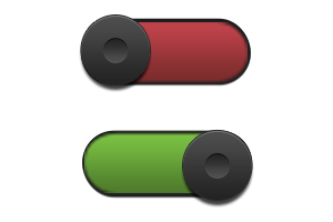
Bueller, Bueller, anyone? Bueller
The next challenge we faced was how to create both a nice and easy, large scale user interface for checking people in, that used the desired colour palette, but that also kept that really nice aesthetic feeling we had going on with the rest of the website. Tick-boxes weren't cutting the mustard, typing anything in was impractical for the situation, and sliders just seemed like the wrong route to go down. Our designer came up with some really sleek toggle features. Automatically set to 'not here' so that all the staff members had to do was to tap them whilst going through the list. Sleek. Simple. Smashing.So how does it all come together?
If we do say so ourselves, very well! The user goes onto the website, uses the online booking system and calendar to purchase tickets to the event, these are then automatically sent to the register on the iPad so that as soon as the event starts the staff members have a pre-created list of everyone that should be attending. We added another couple of little tweaks here and there, a headcount feature at the top of the page in case of emergencies, brand specific dominant colour highlights, and of course lavishing it in the Kielder branding.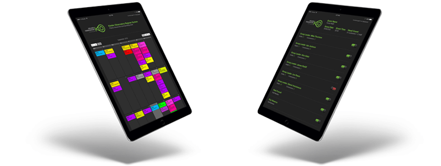
The finished product is both a simple and effective solution that works well in it's designated environment and eliminates a lot of previous issues the staff were facing. We often find that clients come to us with an issue that they can only imagine would be a huge undertaking, but more often than not we can collectively come up with a cost effective solution that goes beyond their furthest expectations. Get in touch today if you've got a problem you'd like us to take a creative eye to!